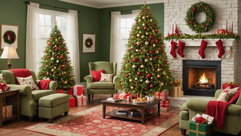
The festive season calls for websites that spread joy and cheer. Whether you’re designing for Christmas, Hanukkah, or New Year, a holiday-themed homepage can help connect with your audience on a deeper level. In this article, we explore some cheerful examples of holiday homepage designs, highlighting the essential elements that make them successful.
1. Vibrant Color Schemes

One of the most striking elements of a holiday homepage design is the use of vibrant color schemes. Bright reds, rich greens, sparkling blues, and golden hues can effectively capture the festive spirit. The clever use of these colors can instantly put visitors in a holiday mood.
When choosing colors, it’s important to consider the holiday theme:
- Christmas: Red, green, and gold
- New Year: Silver, gold, and black
- Hanukkah: Blue, white, and silver
Pairing these colors with thoughtful graphics and typography can create a cohesive and inviting experience for your users.
2. Festive Imagery

Incorporating festive imagery is another way to bring cheer to your holiday homepage design. Images of snowflakes, Christmas trees, menorahs, and fireworks can all enhance the visual appeal of your site. Effective use of these elements can transport visitors to a winter wonderland or a lively celebration.
Make sure the images are high-quality and relevant to the holiday. Consider using:
- Background images that set the scene
- Icons and illustrations to add a whimsical touch
- Photographs to convey emotion and authenticity
This helps to make your website more engaging and memorable.
3. Interactive Elements

Interactive elements can make a holiday homepage design stand out and engage visitors. Features like animated snowflakes, countdown timers to holiday events, or interactive quizzes can add a layer of excitement.
Consider these interactive ideas:
- Advent calendars with daily surprises
- Virtual greeting cards that visitors can customize and send
- Interactive maps showing holiday events or light displays
By making the experience interactive, you encourage visitors to spend more time on your site, which can lead to higher engagement rates.
4. Personalized Greetings
Adding personalized greetings is a great way to make your site feel more welcoming during the holidays. Simple yet heartfelt messages addressed to your visitors can make a big difference in how they perceive your brand.
You can use techniques such as:
- Greeting banners that address the visitor by name
- Personalized emails with festive offers
- Interactive chatbots that offer holiday cheer
This personalization can create a more intimate and inviting experience, fostering a stronger connection with your audience.
5. Seasonal Offers and Promotions
Another effective strategy for holiday homepage designs is to include seasonal offers and promotions. Holidays are a prime time for shopping, and showcasing exclusive deals can drive traffic and sales.
Consider using:
- Banner ads with limited-time offers
- Pop-up windows with special discounts
- Featured products with festive packaging
A well-designed promotional section can entice visitors to take advantage of your holiday deals, ultimately boosting your bottom line.
Conclusion
Crafting a cheerful and inviting holiday homepage design can significantly enhance your website’s appeal during the festive season. By incorporating vibrant color schemes, festive imagery, interactive elements, personalized greetings, and seasonal offers, you can create a magical experience for your visitors. Not only does this foster a sense of joy and community, but it can also drive engagement and sales. Start planning your holiday homepage design today to spread cheer and boost your online presence.
FAQ
1. Why is a holiday-themed homepage important?
A holiday-themed homepage captures the festive spirit and connects with visitors on an emotional level, increasing engagement and potentially boosting sales.
2. What colors are best for holiday homepage designs?
The best colors depend on the holiday. Red, green, and gold work well for Christmas; silver, gold, and black for New Year; and blue, white, and silver for Hanukkah.
3. How can I make my holiday homepage more interactive?
Add interactive elements like animated snowflakes, countdown timers, or quizzes. These features can make your site more engaging and enjoyable for visitors.
4. What kind of festive imagery should I use?
Use high-quality images relevant to the holiday, such as snowflakes, Christmas trees, menorahs, and fireworks. These elements enhance visual appeal and set a festive tone.
5. How can I promote holiday offers effectively?
Showcase seasonal offers using banner ads, pop-up windows, and featured products with festive packaging. This can entice visitors to take advantage of your special deals.


